Add and manage widgets
Add widgets to the dashboard canvas and adjust their position and size. Use the widget menu to clone, lock, download, or delete a widget.
Add a widget
- Open the Widget Library panel on the left.
- Select the required widget type.
- Drag the widget onto the canvas or select it to add it. While dragging, the canvas grid previews the placement.
Widget types
Widgets are grouped into Statistics Card, Visualization, Table, Control, and Content categories. See Chart reference for each widget's purpose and required inputs.
Position and resize widgets
- Move: Drag the widget header to the required position. A placement preview appears while moving.
- Resize: Drag the handle at the bottom right of the widget.
- Automatic layout adjustment: When a widget moves, surrounding widgets shift to fit the grid.
Widget action menu
Open More at the top right of a widget to run these actions.
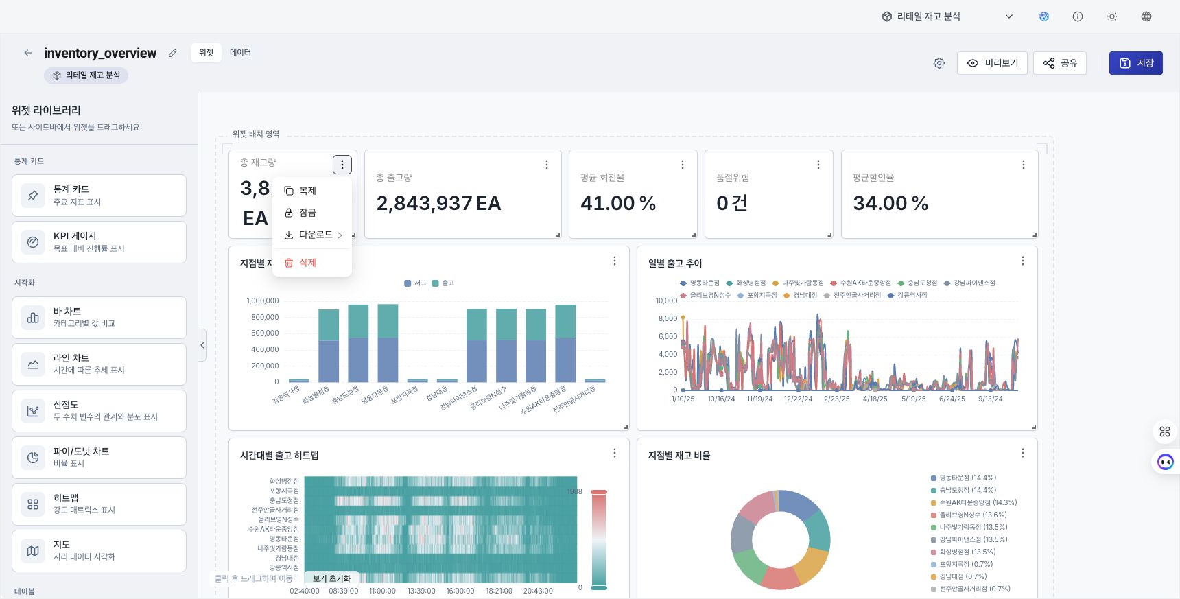
- Clone: Add a new widget below the original with the same settings.
- Delete: Remove the widget. You can also select the widget and press
Delete. The key does not delete the widget while the cursor is in an input field. - Lock / Unlock: Prevent or allow moving and resizing. Settings remain editable while locked.
- Download: Export the data queried by the widget.
- CSV: Save the original widget rows as a CSV file. Korean characters remain intact when the file is opened in Excel.
- Excel (.xlsx): Save the same original rows as an Excel file.
- PNG: Capture the widget body as an image. Resize handles, the
⋯menu, and the lock badge are excluded. - For a text box, external-site embed, or date-range selector without data, only PNG appears.
- The saved file name includes the widget title (or type) and the download date and time.
- Open in new tab: Open the URL from an external-site embed widget in a new tab.
Builder Data tab
The builder header has a Widgets / Data toggle beside the alias. Switch to Data to hide the Widget Library and configuration panel and replace the center area with data exploration.
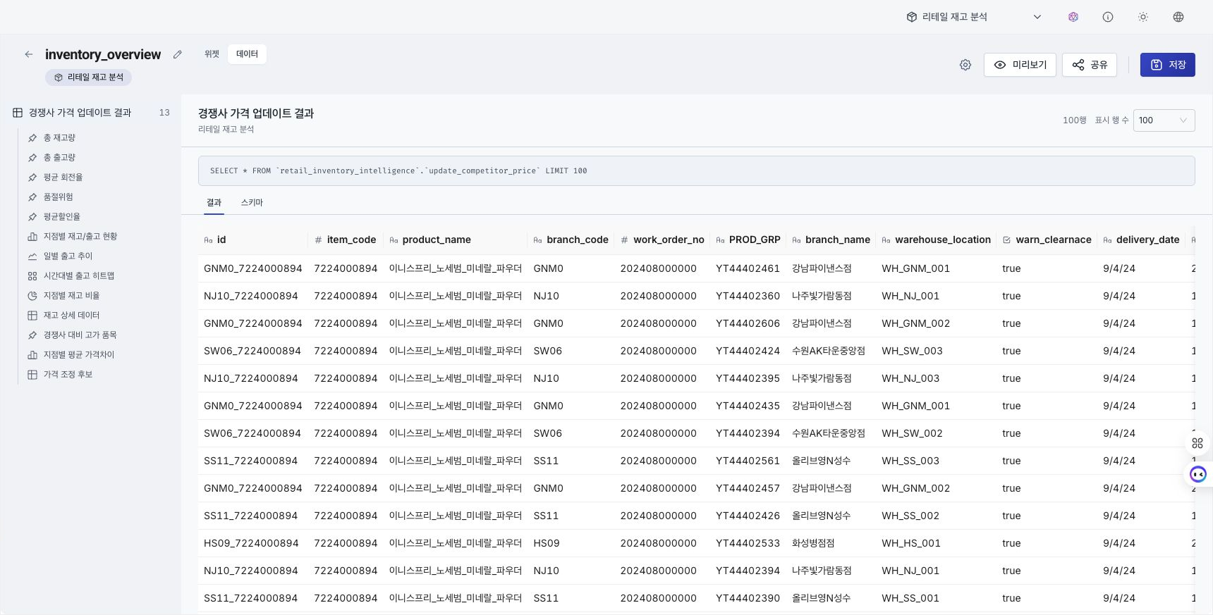
- Left tree: Lists connected analysis sources (datasets, entities, and relationships) and the widgets that use each source. Hover over a widget row and select the
↗icon to select that widget on the Widgets tab. - The right area shows data for the selected source or widget.
- Select an analysis source to preview raw data with
SELECT * FROM database.table LIMIT N. Choose aLIMITof 10, 100, 500, or 1000. - Select a widget to preview query results with the DRS date range applied.
- Select an analysis source to preview raw data with
- Switch between rows and column information with the Results / Schema tabs. Results shows queried rows. Schema shows column names and types. Type icons represent numeric (
#), text (Aa), date (📅), Boolean (☑), object ({}), or unknown (?). - If you select a widget on the canvas before opening Data, that widget's query result is selected.
- The Data tab is read only. You cannot edit or run SQL here.
Widget settings
Select a widget to open the configuration panel on the right. Drag the panel's left edge to resize it.
1. Basic information
- Title: Enter the title displayed above the widget.
- Description: Enter additional information about the widget.
2. Data settings
- Data mode: Choose Simple Mode or SQL. SQL mode provides the SQL editor, AI code generation, and AI editing.
- Analysis source: Choose the connected data source. Select Dataset / Entity / Relationship in the segmented control. The candidates are automatically limited to the dashboard's collection, so you do not choose a collection again in the panel.
- Column mapping: Set the X-axis, Y-axis, and value fields.
See Configure widget data for analysis-source and column-mapping procedures.
3. Display options
- Adjust colors, legend visibility, and axes according to the chart type.